David Russell · 9 October 2026
Revealing Source Diversity Patterns in Independent Web Projects Through Network Diagrams
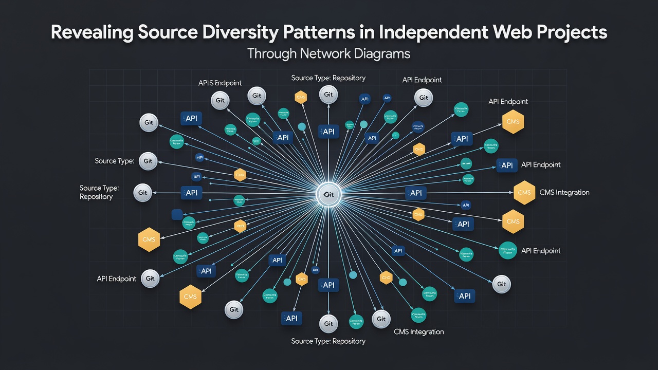
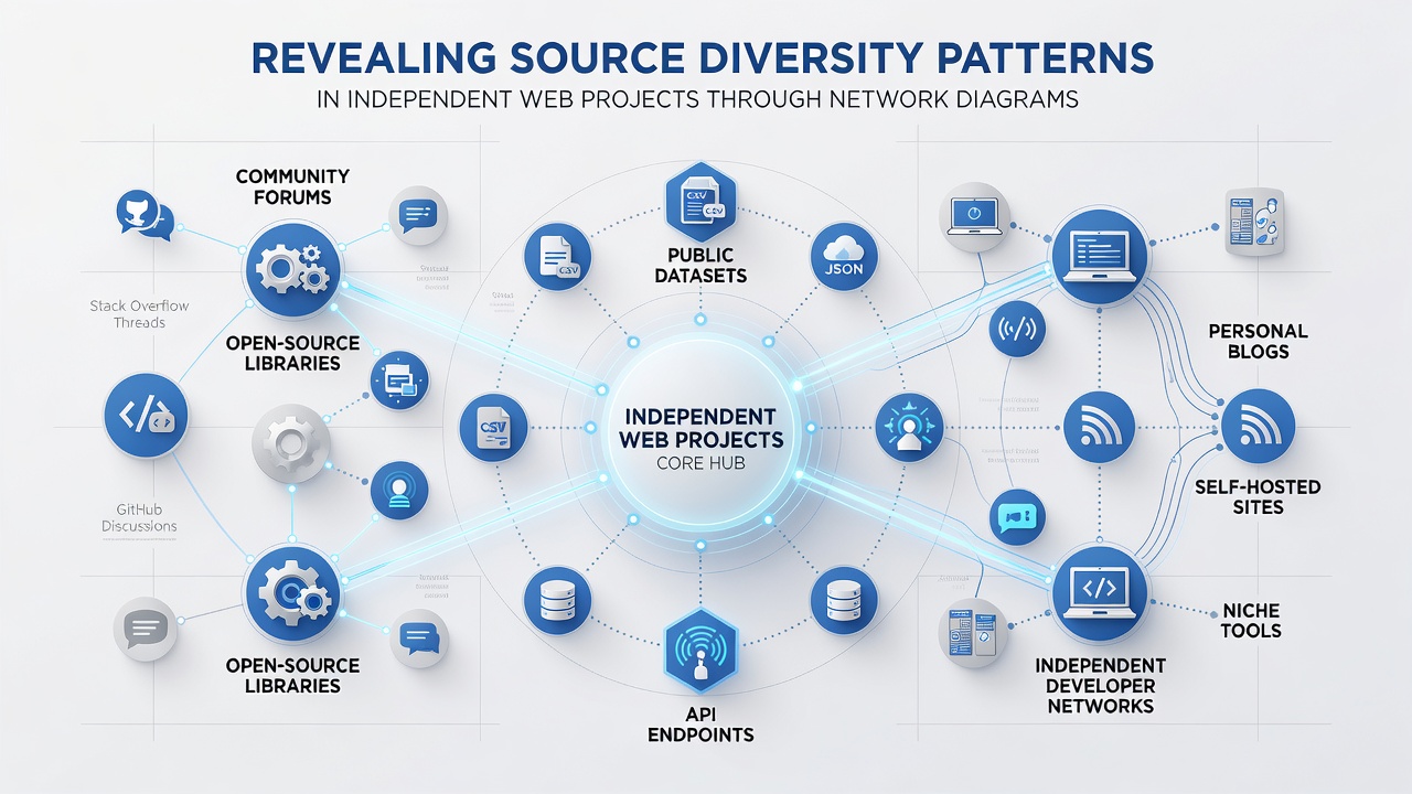
Network diagrams have become a practical method for mapping how traffic reaches independent web projects, and observers note that these visualizations highlight patterns in source diversity that traditional analytics tables often obscure. Researchers apply graph-based representations where nodes represent referral domains, search engines, social platforms, and direct visits while edges illustrate the volume and direction of connections between them. This approach allows analysts to see clusters of related sources and identify gaps in distribution that affect long-term stability for standalone sites.
Core Elements of Network Diagrams in Web Analytics
Independent projects rely on varied acquisition channels, and network diagrams organize those channels into visual structures that reveal both concentration and spread. Each node carries attributes such as traffic share and bounce rate, while edge thickness encodes the strength of referral relationships. Analysts who examine these graphs can quickly distinguish between projects that draw from narrow clusters and those that maintain broader, more resilient patterns across multiple categories.
Data collected through October 2026 shows continued growth in the number of smaller sites adopting these visualization techniques, particularly as open-source tools lower the barrier to entry. Observers note that projects with more than twelve distinct source nodes tend to display lower volatility during algorithm updates, a pattern documented across multiple independent case studies.
Measuring Source Diversity Through Visual Mapping
Traditional metrics like percentage breakdowns provide snapshots, yet network diagrams add relational context that shows how sources interact. A project drawing equal shares from search, newsletters, and niche forums appears balanced in a pie chart, but the diagram may expose weak bridges between those clusters that limit cross-pollination. Experts have observed that sites with strong inter-source connections maintain steadier visitor flows during seasonal shifts.
According to Statistics Canada reports on digital participation, smaller Canadian web operations increasingly track referral networks to understand audience fragmentation. Similar findings appear in European datasets where independent publishers use graph metrics to compare their source structures against industry benchmarks.
Practical Applications for Standalone Platforms
Webmasters apply network diagrams during periodic audits to test whether new content channels integrate effectively with existing sources. One documented workflow involves exporting referral logs, constructing the graph, then calculating centrality scores to locate dominant nodes. Projects that reduce reliance on any single node above twenty-five percent of total traffic often record improved resilience in subsequent quarters.
Academic researchers have published methods that combine network diagrams with time-series overlays, allowing viewers to watch source diversity evolve month by month. These layered visuals help teams identify emerging platforms before they reach mainstream saturation and decide whether early adoption aligns with audience profiles.
Tools and Data Preparation Steps
Analysts begin by cleaning referral strings to group subdomains and standardize social media domains, then import the processed data into graph libraries. Open-source options such as Gephi and Cytoscape handle layouts that emphasize modularity, while commercial platforms offer automated clustering that highlights isolated source groups. Observers note that consistent taxonomy rules across datasets remain essential for accurate comparison over time.
European Union digital economy statistics indicate that adoption of advanced visualization techniques among independent operators rose steadily through 2025 and into 2026, driven partly by improved documentation and template libraries shared within creator communities. Those who maintain updated source graphs report faster diagnosis when traffic patterns shift unexpectedly.
Interpreting Clusters and Gaps
Network diagrams frequently surface clusters around geographic or topical affinities, such as regional news aggregators linking heavily to one another while remaining disconnected from international directories. Projects that deliberately cultivate links across clusters demonstrate higher diversity scores measured by entropy-based metrics. Analysts use these scores to set targets during outreach campaigns and content repurposing efforts.
Longitudinal studies published by university research groups show that sites updating their diagrams quarterly detect source erosion earlier than those relying solely on aggregate reports. Early detection allows time for diversification before revenue impacts compound.
Conclusion
Network diagrams translate raw referral data into relational maps that expose both the strengths and vulnerabilities of source portfolios for independent web projects. As datasets from October 2026 continue to accumulate, practitioners gain clearer benchmarks for evaluating diversity and planning adjustments. The technique integrates cleanly with existing analytics workflows and provides actionable visual cues that spreadsheets alone rarely deliver.